Integrating social share buttons on your blog post can significantly increase reach and visibility by making it easy for readers to share, boosting traffic, improving SEO, providing social proof, and enhancing brand engagement.
These buttons make it easy for readers to share your content on their social media profiles, potentially attracting a wider audience. The more your content is shared, the higher its chances of going viral, driving more traffic to your site. Social share buttons also improve your blog’s SEO by generating more backlinks and increasing your content’s engagement metrics. Additionally, they provide social proof, showing new visitors that your content is popular and worth reading. Finally, these buttons can enhance your brand’s presence on social media, fostering community engagement and loyalty.
Here is the GitHub repo with the full code, where you can see the two new components.
Example page hosted on Vercel -> https://nextjs14-azureb2c-prisma.vercel.app/
Two popular NPM Packages are available
(Great and easy solution if you need to use share count)
(Lightweight solution, higher performance, no share count, just sharing)
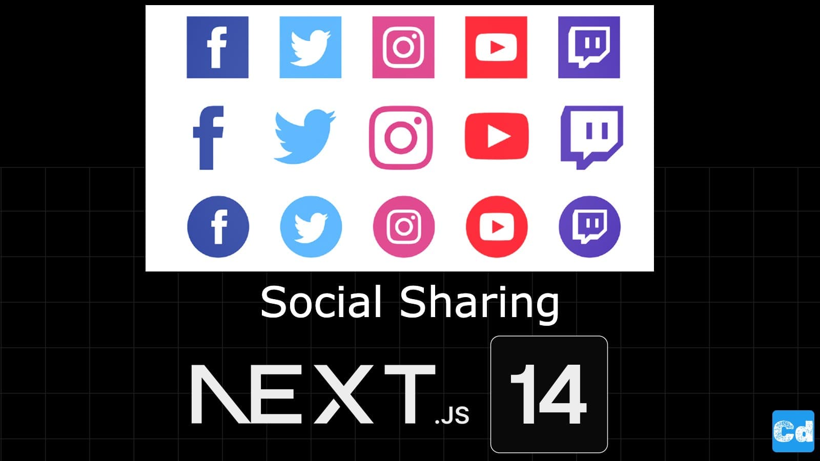
Available Share Buttons

Let’s start with React-Share-Kit
I create a new Component for each React-Share Package.
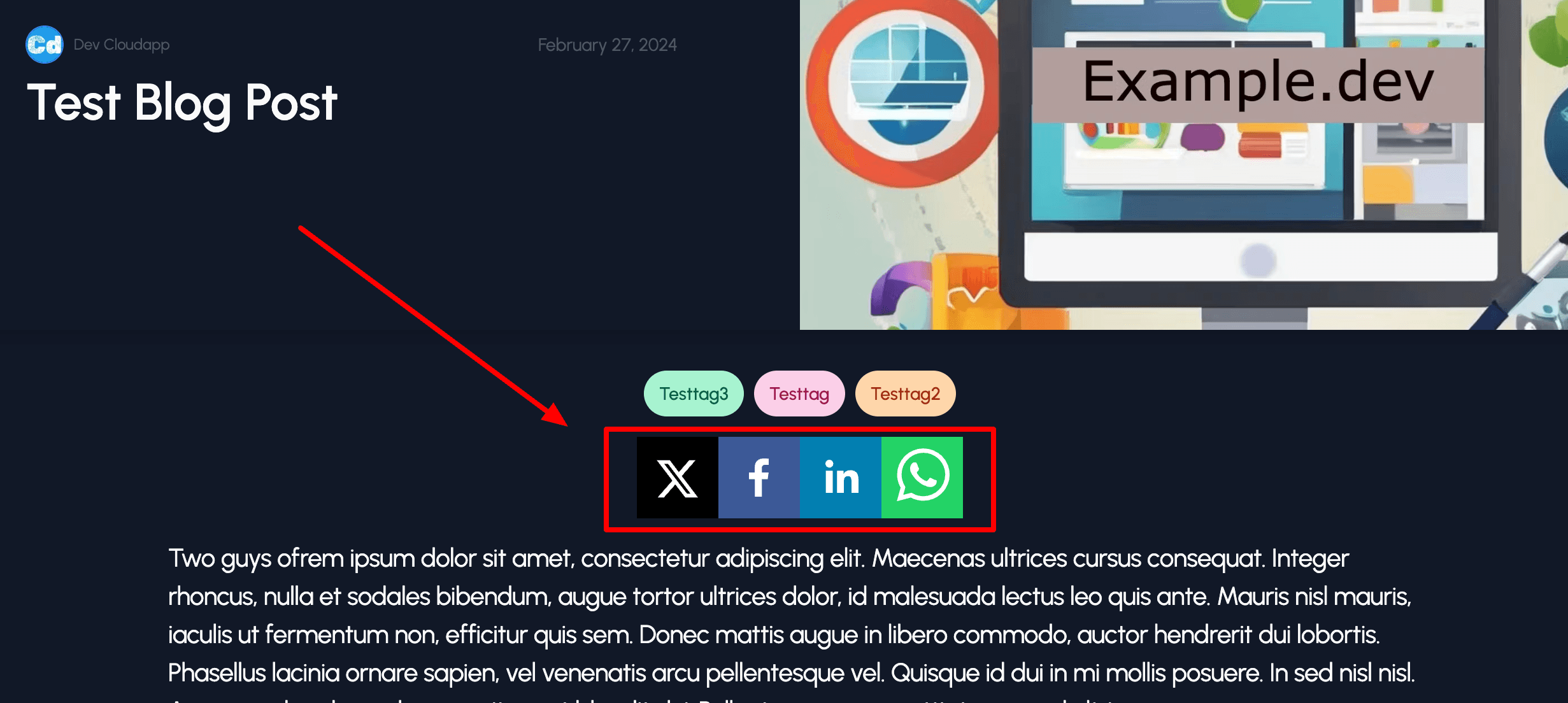
Under src/components/sharing/ I create the file socialsharing.component.tsx for React-Share-Kit. You can see that I am using “Twitter, Facebook, Linkedin and Whatsapp”. For Facebook, we can use the count feature as well, but in this case, we need the “appId” and the “appSecret” from Facebook.
Import new Component into Blog Page
Now, I will import the new component into the Blog page under src/app/[locale]/[slug]/page.tsx
I integrate the component under the Tag Cloud Component. Attributes like title and slug are fetched from Contentful, while I get the locale from the params.
The second Component built on React-share-lite
The second component is more or less the same but without the “Count” feature; therefore, the package is lighter and more performant.
That’s it. It’s pretty easy, and you can integrate as many Share Buttons as you want to facilitate sharing your content.
Final Result
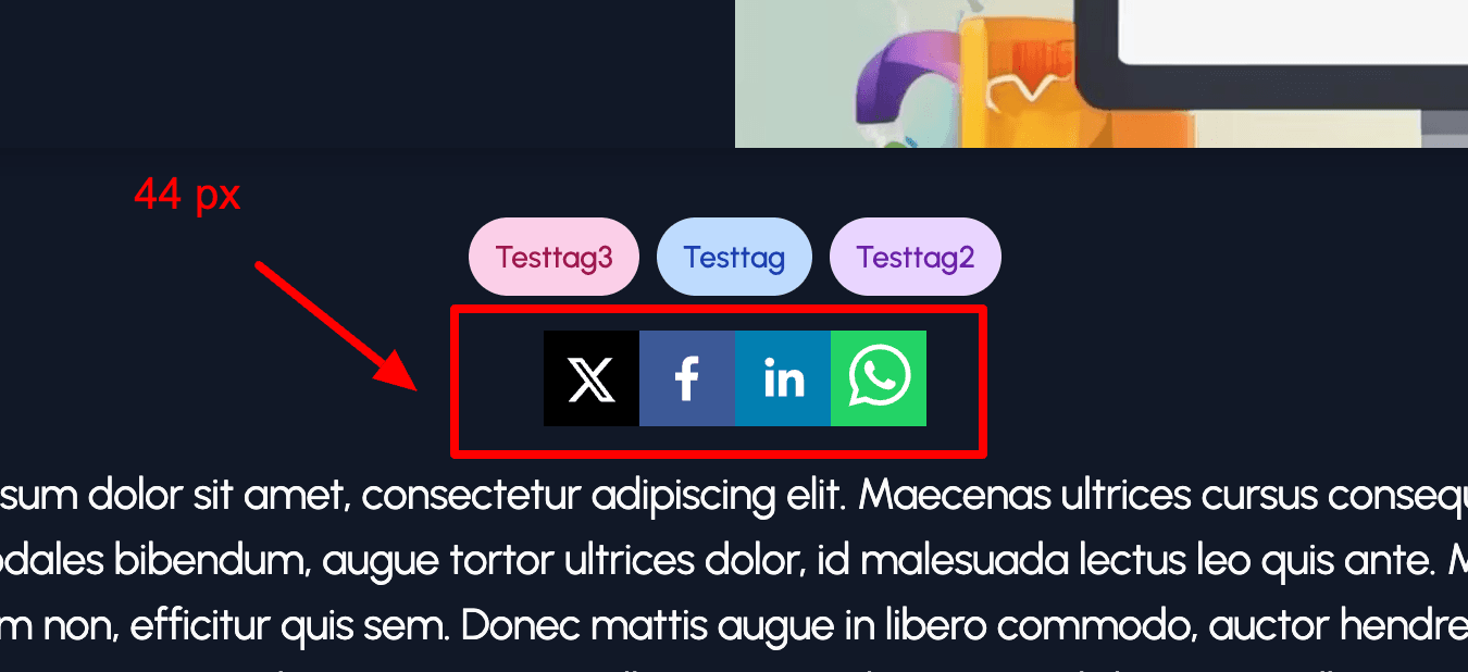
With the size prop you can change the size of the buttons. Defaultsize is 64 px
Change default share button size to 44 px
Cloudapp-dev, and before you leave us
Thank you for reading until the end. Before you go: