Some months ago, when I was working on a project, the Idea came up to animate the button so that it shows “bouncing dots” as long as the process in the background (creating IaC resources) was not finished. After some reflection and a fast search on Google, the solution was clear. Let’s use Tailwind since it was already in place for the project.
NPM Packages
I am using these packages:
"tailwindcss": "^3.4.1",
"postcss": "^8",
"autoprefixer": "^10",
Modifying Gloabl.css
Before we start coding, we add this layer to our global.css file located under src/app/
@layer utilities {
  .animate-bounce {
    animation: bounce 1s infinite;
  }
  .delay-200 {
    animation-delay: 0.2s;
  }
  .delay-400 {
    animation-delay: 0.4s;
  }
  @keyframes bounce {
    0%,
    100% {
      transform: translateY(0);
      opacity: 1;
    }
    50% {
      transform: translateY(-50%);
      opacity: 0.5;
    }
  }
}
Now, with the new “utilities” layer in place, we can start coding.
Creating a new “Loadingbutton”
I created a new component, “loadingbutton.component.tsx” under /src/components/tools/loadingbutton
import React from "react";

interface LoadingButtonProps {
  loading: boolean; // Prop to control loading state
  onClick: (e: React.FormEvent) => void; // Prop to handle button click
  startlabel?: string; // Prop to set the button label when not loading
  loadinglabel?: string; // Prop to set the button label when loading is finished
}

const LoadingButton: React.FC<LoadingButtonProps> = ({
  loading,
  onClick,
  startlabel,
  loadinglabel,
}) => {
  return (
    <button
      onClick={onClick}
      className={`w-full px-4 py-2 text-white rounded-md focus:ring-2 focus:ring-blue-500 focus:ring-opacity-50 ${
        loading
          ? "bg-blue-400 cursor-not-allowed" // Lighter color and disabled cursor when loading
          : "bg-blue-600 hover:bg-blue-700" // Normal hover effects
      }`}
      disabled={loading} // Disable button when loading
    >
      {!loading ? (
        <span>{startlabel}</span>
      ) : (
        <span className="flex items-center justify-center space-x-3">
          <span className="flex space-x-1">
            <span className="dot bg-white w-2 h-2 rounded-full animate-bounce delay-100"></span>
            <span className="dot bg-white w-2 h-2 rounded-full animate-bounce delay-200"></span>
            <span className="dot bg-white w-2 h-2 rounded-full animate-bounce delay-300"></span>
            <span className="dot bg-white w-2 h-2 rounded-full animate-bounce delay-400"></span>
          </span>
          <span>{loadinglabel}</span>
        </span>
      )}
    </button>
  );
};

export default LoadingButton;
Interface definition
On the top, we define the interface with four props
interface LoadingButtonProps {
  loading: boolean; // Prop to control loading state
  onClick: (e: React.FormEvent) => void; // Prop to handle button click
  startlabel?: string; // Prop to set the button label when not loading
  loadinglabel?: string; // Prop to set the button label when loading is finished
}
We have a “startlabel” (which is shown before we click the button and a “loadinglabel”, which we show during the animation.
   <span className="flex items-center justify-center space-x-3">
          <span className="flex space-x-1">
            <span className="dot bg-white w-2 h-2 rounded-full animate-bounce delay-100"></span>
            <span className="dot bg-white w-2 h-2 rounded-full animate-bounce delay-200"></span>
            <span className="dot bg-white w-2 h-2 rounded-full animate-bounce delay-300"></span>
            <span className="dot bg-white w-2 h-2 rounded-full animate-bounce delay-400"></span>
          </span>
          <span>{loadinglabel}</span>
        </span>
This example shows four bouncing dots. If you need 5 or 6 dots, add lines and adapt the delay at the end.
Import loadingbutton in component
As the next step, we import the loading button component into our main component.
import LoadingButton from "@/components/tools/loadingbutton/loadingbutton.component";Defining state variables
We define two variables for the loading state and the “hasStorageAccount” state, that we use later for the visualization.
const [loading, setLoading] = useState(false);
const [hasStorageAccount, setHasStorageAccount] = useState(false); // State to check if user already has a storage account
Output
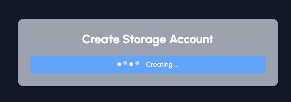
If the state variable “hasStorageAccount” is true, we show the “delete” button; otherwise, we show the “create” button.
  return (
    <div className="max-w-lg p-6 mx-auto mt-6 bg-gray-400 rounded-lg shadow-md">
      <h2 className="mb-4 text-2xl font-bold text-center">
        {hasStorageAccount
          ? "You already have a storage account"
          : "Create Storage Account"}
      </h2>
      {/* Delete Storage Account Button */}
      {hasStorageAccount && (
        <LoadingButton
          loading={loading}
          onClick={handleDeleteStorageAccount}
          startlabel="Deleting Storage Account"
          loadinglabel="Deleting ..."
        />
      )}
      {!hasStorageAccount && (
        <LoadingButton
          loading={loading}
          onClick={handleSubmit}
          startlabel="Creating Storage Account"
          loadinglabel="Creating ..."
        />
      )}
    </div>
  );
That’s it. As you can see, with a couple of code lines, we can create nice-looking animations and use them everywhere.
Cloudapp-dev, and before you leave us
Thank you for reading until the end. Before you go: